

Dartmouth Atlas: COVID-19 Is Everywhere
Every day since the COVID-19 pandemic first unfolded, the Dartmouth Atlas Project has been charting its geography in the U.S., providing timely insight into the growth rate of cases.
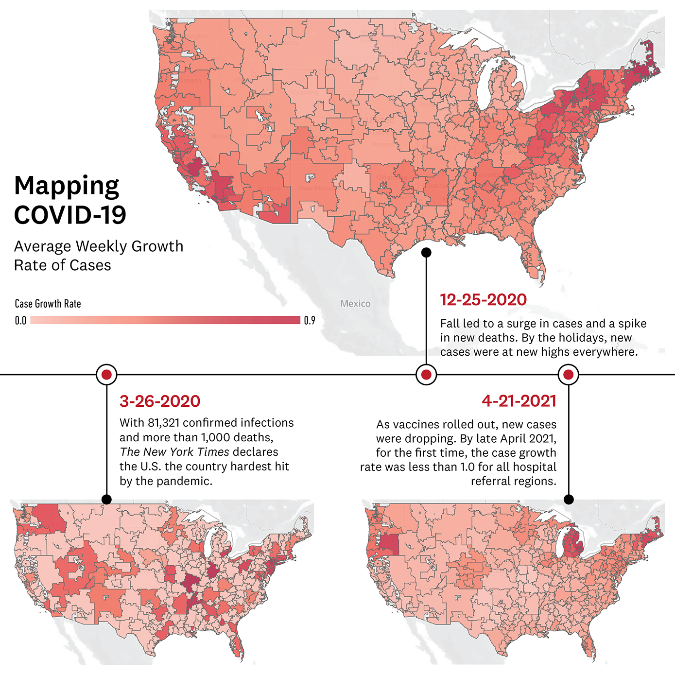
Healthcare ChallengeThe New York Times documents March 26, 2020 as the day that the United States “officially became the country hardest hit” by the COVID-19 pandemic. Early on, it became challenging to understand how widespread the novel coronavirus was in the U.S., as different maps depicted different assessments. In some cases, aggregating data by county presented a falsely reassuring pattern, according to researchers from The Dartmouth Institute’s Dartmouth Atlas Project.
To get a better handle on the geography of COVID-19 cases, the Dartmouth Atlas team, including Elliott Fisher, Jonathan Skinner, Sukdith Punjasthitkul, and Anoop Nanda '21, a Dartmouth undergraduate student, applied the Hospital Referral Region (HRR) methodology. Dartmouth Atlas divides the U.S. into hospital referral regions, where patients go for specialized care in addition to where they are admitted when they are hospitalized. Since HRRs include all rural areas of the country, the entire U.S. is represented in these regional analyses. They also provide a more accurate tool than geographic boundaries for assessing the relative capacity of local healthcare systems. In all, the 306 HRRs used by the Dartmouth Atlas are a widely used standard for healthcare policy and research.
How we’re meeting it
Each day over the last year, the Dartmouth Atlas team downloaded county-level data published by The New York Times. They ran analyses and created visualizations to map the growth rate of cases. They produced maps depicting the number of COVID-19 cases per 100,000, the average daily growth rate of COVID-19 cases in the last seven days, and the number of COVID-19 deaths per 100,000. At a time when many Americans did not yet believe the virus would affect them, the Atlas team showed that the disease was indeed affecting every region in which residents get hospital care.
The maps highlight significant trends, from showing a drop in new cases during April and May of 2020, likely due to the impact of lockdowns, to the surges of summer and holidays as COVID-related restrictions relaxed.
The team’s analysis was cited in several mainstream media outlets including CBS News, NPR, and Vox, and they described a ‘more realistic picture’ of what was happening in the U.S. in a blog post for Health Affairs. Project manager Sukdith Punjasthitkul also converted the data they used for the maps into a widely usable format, creating a data output for anyone to access and run their own analyses by hospital referral regions.
Additionally, in collaboration with Microsoft Healthcare NeXT and CareJourney, Dartmouth Atlas also issued data about the regions in the U.S. with Medicare beneficiaries over the age of 65 who have two or more chronic conditions—the people most vulnerable to developing severe cases of COVID-19. Chronic diseases include diabetes, vascular disease, chronic kidney disease, heart disease, lung disease and cancer. The concentration of highest-risk people ranged from less than 2 percent to over 22 percent, with many living in Florida. (The team drew on data from 2018 Medicare claims data and the U.S. Census estimates of the age distribution of the U.S.)
Today, as the number of new cases and deaths continue to decrease, and the number of COVID-19 vaccinations increase, the data tells a much different story.